The studio class has been greatly enjoyable. It's been really rewarding, despite differences, to undertake a large year long group project. I've learned a lot about myself and the ways I function in a group dynamic, most surprisingly my desire for control. If this were the film industry, you might say I'm a real auteur, aspiring for the role of director. Compromising on ideas or otherwise scrapping them altogether has been the largest challenge for me in the whole project. Seeing the values of others and the ways in which they work has also helped me to be able to distinguish who I am as a designer and what I value in a game design, as well as what traits I would potentially seek in considering a game development collaboration: that being excellent coding skills (thanks Tom) and primarily very similar ideals and vision.
If I were to suggest changes to the studio unit, it might be to allow a higher level of freedom for the students to determine their group sizes and development platform. I feel that individual projects could be just as rewarding and contain valuable lessons for the individual, however there is a wealth of lessons to be learned from a group dynamic, as I have found. Specifically for me, it would be interesting to undertake an individual project (given the right choice of platform that would negate my lack of coding skill) and discovering my level of competence at creating a full featured game based on my own skills alone. This is rather something I should be doing as an aside from studio however, and as such it's likely preferable to keep the group specification.
Most notably interesting about studio classes is the dynamic between the tutors Matt and Derrick. Given that they have such differing approaches to not only teaching, but also games and life in general, it has been really interesting to witness the dynamic, and at times conflict, between them and the ways in which it plays back into how they influence the students. Discussion of design ideas and witnessing the sidings taken by Matt and Derrick have been the most entertaining (if frustrating) part of the studio classes. In future, whether it remains both Matt and Derrick or someone else entirely, I would most certainly argue that having 2 tutors present for the classes is valuable and beneficial to the experience.
As for my future, given that I aim to continue study at Monash to complete my unfinished Bachelor of Arts degree, I have no immediate plans to jump in to the game development industry. My interest in game design has only increased as a result of undertaking this course and I have particular aspirations to one day see through many game design concepts I have been developing. The lesson I've learnt from the course as a whole is that it may be prefereable for me to persue such endeavours as an individual rather than entering into the industry, particularly given its focus of late on uninspired franchise iterations designed primarily for maximum market penetration. Either way, it'll be particularly interesting to witness the direction the games industry takes in the future, as it evolves as a relatively young artistic medium in the face of political opposition and despite over saturation. I've especially got my eye on the independent game development stream.
Thursday, October 14, 2010
bipolar SPECIAL
WHAT IS...
 This is an exploration of ideas and changes I would like to have seen in the finished version of the game. It is not meant to discredit anything about the actual finished version of bipolar, it is merely a way to show my vision of what the game would be if I was in charge of all design aspects. As the original game concept of platforming involving magnetism is something I'm quite fond of, it is something I may return to explore at a later stage. Some of these elements may or may not be incorporated in such a case.
GAME SETTING
Firstly, as it stands, Bipolar has no definite setting. Whilst this isn't a problem and was designed as such in order to focus more on the functionalities of the gameplay, I feel careful incorporation of a setting could benefit the game design a lot.
The originally proposed space setting is one that could add much to the game. Having more featured environments set in space, incorporating things like black holes or other physics bending elements. It is however a largely overused setting and for this reason may be best avoided.
The circuitry concept that inspired the game's menu could be extended to include more elements of a computer system. Imagine the player as a data element, advancing through the inner workings of a computer, where bits and bytes rule, data is of the utmost importance, and polarity is your means of traversing the circuits. The computer concept holds a rich array of possibilities that could be married with the magnetism concept quite well. It is also something infrequently used as a game setting and thus could really bolster the originality.
In any case, it may be preferable to rework the title of the game, for although it fits well in considering the games functionality alone, it however does unavoidably hold connotations with the mental disability. This is not a necessarily bad thing, though it's foreseeable that negative reactions may result from it.
STAGE DESIGN
As it stands, the game's early stages hold a number of relatively uninspired short levels designed as tutorials to help the player understand the gameplay. I feel this is an unnecessary simplification of things and results in a number of "dead space" stages that the player is unlikely to ever return to. It is also condescending in a way, presupposing the player requires bite size pieces of information, afraid of complexity. After all, the game interactions are in no way complex, making use of only 4 buttons; instruction does not have to be so explicit.
As an alternative, early stages may still retain teaching elements, progressively introducing new elements and the controls, but done so in a much more interesting and challenging way. Some of this idea is detailed in the earlier post titled "Progressive Disclosure in Stage Design".
Presently the game displays at the beginning the complete array of controls that the player can utilise. Contrary to the team's intention, and despite my arguments against it, this is more overloading than anything else and is exactly what the team wanted to avoid. A better solution would be to remove the controls screen altogether, and instead have in specific stages, a new control interaction introduced via a simple graphic in the background or as part of the stage layout.
On the topic of tutorials: some game elements are just poorly introduced despite the inclusion of a specific tutorial level. For one, the "camera" objects, in every instance I've seen players encounter them, have proved to be nothing but confusing. While they are not a badly designed game element, they do require the most careful explanation of their function, something which their introduction stage has failed to do.
REPLAY CHALLENGE - PAR TIMES
Something I've been arguing for all year is the inclusion of "par times", which function as a set challenge time for each level for players to return to and attempt to beat. In my game playing experience I have seen this mechanic used countless times and it has always been very effective at extending the challenge and life of a game beyond the initial play through. The mechanic can even be employed in a multi-fold way; having several levels of challenge, e.g.: bronze time, silver time, gold time.
ADDITIONAL SHAPES
Included in the final design is the option for the player to change their player shape from a cube, to triangle, or octagon, etc. Whilst I acknowledge the freshness and fun this choice provides to the game, the issue is that none of the stages have been designed for anything but the square, and hence as an added feature it is unrefined and detracts from the overall presentation.
Removal of the extra shape options is preferable to what is in place at the moment. Alternatively, having stages designed for a specific shape, and having the player shape change per stage, would add variety to the game as a fully developed feature.
SOUND DESIGN
I've been truly amazed and impressed by the soundtrack the other members have put together, given that non of us have any background in sound composition. Despite this, there are still gaps in the sound design implementation.
Some interaction would benefit from sound cues. Interacting with magnetic fields could have a humming sound to indicate them having an effect on the player. The player object's collision with solid objects (walls, platforms, etc.) would benefit from a slight unobtrusive tap sound. Overall, just adding depth via sound to the environment and interactions would improve the game greatly.
ENVIRONMENTS
The vision I had of the gameplay in the early stage of development included large expansive stage designs, requiring a level of exploration and instilling a sense of discovery in the gameplay. The stage design we ended up having more of is tight confined rooms requiring more precise finessing of the controls more than anything else. This sort of challenge is perfectly fine, though I would have liked to include more variety in the stage design, taking the direction away from "puzzle" and more towards free form "adventure-platforming".
Revisiting the Group Dynamic
A.K.A. - My waning interest.
To begin: I'm very impressed with what our studio team has accomplished over the past 2 semesters. We've completed a relatively full featured game that really shows our all our individual talents of coding, art design, level design, sound design and management. I think a lot of our success is attributable to maintaining the scope of the project as something manageable and not overly ambitious, also the absurd amount of coding that Tom did in the early stages to put together a robust and full featured game engine.
The team has also fared well at working together, for the most part aiming towards the same goal that was set in semester 1. There has however been a large number of disagreements over design considerations that I have found to be particularly frustrating and has unfortunately resulted in me feeling mostly apathetic towards the project at this late stage.
Whilst my level of contribution to the game of late may not be all that apparent, I have in fact been quite busy designing and redesigning many elements of the game. The issue is that they've been largely met with opposition from the rest of the team, and hence left out of the design in favour for what was already present. It is arguable that this has been beneficial for the project, in that the rejection of new elements has helped to avoid dreaded scope creep that may have resulted in a directionless, underdeveloped game. The consequence however is that I've been left with a distasteful feeling of being undervalued in the design process, leaving me somewhat disenfranchised with the whole project. This feeling may be largely attributable to my desire of executive control over the game's design; admittedly the most important lesson I've learned this year concerns the difficulties of working in a group environment where differing goals and ideals must be somehow consolidated (something I'm obviously still coming to terms with).
Regardless, I've found it very discouraging to have the larger portion of my designs rejected by the team, whilst having to watch as the game design heads in a direction I'm somewhat displeased with. It is interesting to note the different levels of satisfaction felt by the team members: Jason in particular feeling adamant that we have created an A-class design worthy of retail release, I however hold some reservations as to the level of quality of our game when put in direct comparison with most retail releases (the method by which we release the game is a whole other issue alone).
We have declared the game entirely finished at this stage, whilst there is still a lot of things I would like to see reworked and further developed. Despite being proud of the work I have attributed to the project, the project as a whole has left me unenthusiastic about the prospect of working as part of a game development team in the future. The benefit of the process is that it has really helped me to cement in my mind what I value from a game design; it has been a truly interesting experience, though not without its negatives, that I feel will really influence my work in the future.
Level Backgrounds
Whilst I personally would have been happy with nothing but black backgrounds for all the levels, as it fits the minimalist aesthetic whilst avoiding cluttering the game screen and potentially confusing the player, the rest of the team has been very adamant about their inclusion. I thus considered a number of possible concepts for background designs, my primary concern being to avoid busying the game screen resulting in player confusion.
CIRCUITRY BACKGROUND
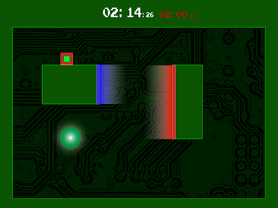 The first concept was simply something that aims to match the in game graphics with the menu graphics; incorporating the circuitry aesthetic into the game world. Addiotionaly altering the standard neutral grey colour scheme of the platforms to the dark green used previously. Whilst working relatively well, I don't feel the use of the green coloring alone marries the two aesthetics completely. I would preferably like to incorporate more of the circuitry design into the game world to better refine the overall aesthetic, though the complexity level of doing such a thing is quite high and result in redesigning a lot of the game.
SIMPLE GRADIENT BACKGROUND
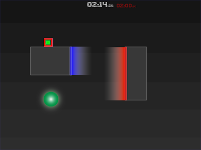
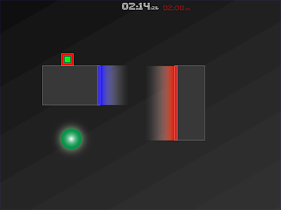 This is a very basic design which keeps the minimal aesthetic and avoids confusing the game screen. It also serves a secondary function of illustrating the gravity orientation, should it appear different from the norm.
PICTURE IN PICTURE BACKGROUND
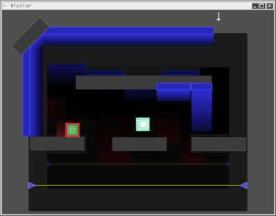 My personal favourite concept. Imagine all the levels of the game as a series of overlayed screens or "window", each successive one visible behind the previous, creating a picture in picture effect. The result is that the player has the feeling of advancing deeper and deeper into something as they progress through each stage. We could go as far as to animate the player object jumping between each one.
The chief concern is that, more than anything else, this design will serve to confuse the player, with background objects appearing as though they may be foreground interactive objects. Substantially darkening the background scene may be a viable solution to this, or else somehow distorting the background scenes to differentiate them from the foreground. It would also require a large amount of coding in order to develop a system to render the stages in the background.
CIRCUITRY BACKGROUND
 The first concept was simply something that aims to match the in game graphics with the menu graphics; incorporating the circuitry aesthetic into the game world. Addiotionaly altering the standard neutral grey colour scheme of the platforms to the dark green used previously. Whilst working relatively well, I don't feel the use of the green coloring alone marries the two aesthetics completely. I would preferably like to incorporate more of the circuitry design into the game world to better refine the overall aesthetic, though the complexity level of doing such a thing is quite high and result in redesigning a lot of the game.
SIMPLE GRADIENT BACKGROUND

 This is a very basic design which keeps the minimal aesthetic and avoids confusing the game screen. It also serves a secondary function of illustrating the gravity orientation, should it appear different from the norm.
PICTURE IN PICTURE BACKGROUND
 My personal favourite concept. Imagine all the levels of the game as a series of overlayed screens or "window", each successive one visible behind the previous, creating a picture in picture effect. The result is that the player has the feeling of advancing deeper and deeper into something as they progress through each stage. We could go as far as to animate the player object jumping between each one.
The chief concern is that, more than anything else, this design will serve to confuse the player, with background objects appearing as though they may be foreground interactive objects. Substantially darkening the background scene may be a viable solution to this, or else somehow distorting the background scenes to differentiate them from the foreground. It would also require a large amount of coding in order to develop a system to render the stages in the background.
Heads Up Display Design
From early on our game has had a Heads Up Display (HUD) that display the stage title, stage time and gravity strength. The trouble is that it looks rather like a debug menu and detracts from the in game aesthetic. With this in mind I went about redesigning the HUD to something more minimal and unobtrusive, attempting to also match it to the menu design.
Ideally I'd have preferred there to be no static HUD elements, instead having information appear only when applicable.
TIMER
For one, the timer should not appear on the player's first run through a new stage, only appearing after they have completed it and returned, in a way presenting a new challenge for them: improve your time.
TIME OVERLAY
 This design may not be immediately apparent, but the actual timer has been overplayed across the game screen with a very low transparency level. As a means of making it more apparent it could cycle through higher and lower transparency values. The design is made to be unobtrusive to play with the ideal that it wouldn't even be noticeable unless the player was looking for it, in which case it is in view at all times. In practice however this ideal is hard to achieve and the design would likely only distract the user and confuse the game screen.
TIMER TOP CENTER
 A much more traditional timer display, at the top center of the screen. The secondary time is the target time the player is aiming to beat, turning red once it has elapsed to show to the user that they have failed. As the only HUD element, the game screen is kept to a minimal number of elements, avoiding any unnecessary distractions to the player.
STAGE TITLE
 Rather than having the stage title ever present as part of the HUD, I felt a better solution would be to have it appear as the stage begins, before retracting after a short time. This should give the player ample time to read the stage title and avoids having the information present at all times, serving as an unwanted distraction.
PAUSE SCREEN
A pause screen should clearly indicate to the player that the game is in a pause state, and display any available options for advancement therefrom. The following are a number of pause screen designs incorporating numerous elements.


 The colouring is obviously aimed to reflect the green circuitry design of the menu screen. The key elements are the stage title, which is present should the player want to recall the stage title (this is important as the stage title will often offer hints as to the stage's method of completion), and the options to RESUME the stage, RESTART LEVEL, and RETURN TO MENU. The explicit PAUSED text can be left out as it's rather obvious and unnecessary and the bipolar title can also be considered unnecessary clutter. The large size text options seen in the final two designs is a bit too much for the desired minimal aesthetic, instead it appears to scream at the player and could be rather discomforting.
REFINED PAUSE DESIGN
 The most ideal pause screen design is above. It's minimal and serves to match the stage title display that would be seen at the stage's opening. Imagine the title panning up partially at stage open, before panning down, then the whole of the pause menu panning up upon pausing the game. Also note the darkened overlay that de-emphasizes what is displayed in the background.
Ideally I'd have preferred there to be no static HUD elements, instead having information appear only when applicable.
TIMER
For one, the timer should not appear on the player's first run through a new stage, only appearing after they have completed it and returned, in a way presenting a new challenge for them: improve your time.
TIME OVERLAY
 This design may not be immediately apparent, but the actual timer has been overplayed across the game screen with a very low transparency level. As a means of making it more apparent it could cycle through higher and lower transparency values. The design is made to be unobtrusive to play with the ideal that it wouldn't even be noticeable unless the player was looking for it, in which case it is in view at all times. In practice however this ideal is hard to achieve and the design would likely only distract the user and confuse the game screen.
TIMER TOP CENTER
 A much more traditional timer display, at the top center of the screen. The secondary time is the target time the player is aiming to beat, turning red once it has elapsed to show to the user that they have failed. As the only HUD element, the game screen is kept to a minimal number of elements, avoiding any unnecessary distractions to the player.
STAGE TITLE
 Rather than having the stage title ever present as part of the HUD, I felt a better solution would be to have it appear as the stage begins, before retracting after a short time. This should give the player ample time to read the stage title and avoids having the information present at all times, serving as an unwanted distraction.
PAUSE SCREEN
A pause screen should clearly indicate to the player that the game is in a pause state, and display any available options for advancement therefrom. The following are a number of pause screen designs incorporating numerous elements.


 The colouring is obviously aimed to reflect the green circuitry design of the menu screen. The key elements are the stage title, which is present should the player want to recall the stage title (this is important as the stage title will often offer hints as to the stage's method of completion), and the options to RESUME the stage, RESTART LEVEL, and RETURN TO MENU. The explicit PAUSED text can be left out as it's rather obvious and unnecessary and the bipolar title can also be considered unnecessary clutter. The large size text options seen in the final two designs is a bit too much for the desired minimal aesthetic, instead it appears to scream at the player and could be rather discomforting.
REFINED PAUSE DESIGN
 The most ideal pause screen design is above. It's minimal and serves to match the stage title display that would be seen at the stage's opening. Imagine the title panning up partially at stage open, before panning down, then the whole of the pause menu panning up upon pausing the game. Also note the darkened overlay that de-emphasizes what is displayed in the background.
Font Design
We needed a font for the game and so I was tasked with finding one suitable for both the game menu and the in game HUD. I sourced a handful of fonts from various free font sites as a means for finding an appropriate design, before heading into photoshop to put together our own character glyphs to use in the game engine.
LED BOARD
 I was particularly fond of the retro pinball arcade look of the LED board font, and thought it matched the circuitry aesthetic well; the rest of the team thought otherwise, desiring a more heavier weight font.
OZONE
.png) This font keeps a similar dot matrix display as the LED board one, but with heavier weight.
This font keeps a similar dot matrix display as the LED board one, but with heavier weight.
HYDROGEN
.png) Again, a similar aesthetic, but the weight isn't quite heavy enough.
Again, a similar aesthetic, but the weight isn't quite heavy enough.
CLUBLAND
.png) This is more like what we wanted; a bold and blocky design that's slightly modern whilst also reminiscent of old pixelated fonts.
This is more like what we wanted; a bold and blocky design that's slightly modern whilst also reminiscent of old pixelated fonts.
OUR FONT - DOT FONT
 With the above fonts as inspiration I put together character glyphs for our font, made out of small dot matrix layouts. The issue we didn't foresee is that at such small resolutions as the characters would appear in our game, all the detail is lost and take on an unfortunate distorted look.
OUR FONT - BLOCK FONT
 The revised design uses a similar arrangement only hard edged squares instead of dots. This design appears as desired at almost any size due to it's lower fidelity. The end result is a much more classic arcade look which I feel still works well with the game's aesthetic.


LED BOARD
 I was particularly fond of the retro pinball arcade look of the LED board font, and thought it matched the circuitry aesthetic well; the rest of the team thought otherwise, desiring a more heavier weight font.
OZONE
.png) This font keeps a similar dot matrix display as the LED board one, but with heavier weight.
This font keeps a similar dot matrix display as the LED board one, but with heavier weight.HYDROGEN
.png) Again, a similar aesthetic, but the weight isn't quite heavy enough.
Again, a similar aesthetic, but the weight isn't quite heavy enough.CLUBLAND
.png) This is more like what we wanted; a bold and blocky design that's slightly modern whilst also reminiscent of old pixelated fonts.
This is more like what we wanted; a bold and blocky design that's slightly modern whilst also reminiscent of old pixelated fonts.OUR FONT - DOT FONT
 With the above fonts as inspiration I put together character glyphs for our font, made out of small dot matrix layouts. The issue we didn't foresee is that at such small resolutions as the characters would appear in our game, all the detail is lost and take on an unfortunate distorted look.
OUR FONT - BLOCK FONT
 The revised design uses a similar arrangement only hard edged squares instead of dots. This design appears as desired at almost any size due to it's lower fidelity. The end result is a much more classic arcade look which I feel still works well with the game's aesthetic.

Finalised Menu Design
The menu design had to be revised slightly as the rotation animation incorporated in the original design was deemed to difficult to implement. As it stands now, the screen pans from area to area, rather than pan and rotate. The design is still very effective and keeps the same aesthetic.
FINAL MENU LAYOUT (TITLE DETAIL)
.png)
FINAL MENU LAYOUT (FULL VIEW)
.png)
FINAL MENU LAYOUT (TITLE DETAIL)
.png)
FINAL MENU LAYOUT (FULL VIEW)
.png)
Finalised Menu Design
The menu design had to be revised slightly as the rotation animation incorporated in the original design was deemed to difficult to implement. As it stands now, the screen pans from area to area, rather than pan and rotate. The design is still very effective and keeps the same aesthetic.
FINAL MENU LAYOUT (TITLE DETAIL)
.png)
FINAL MENU LAYOUT (FULL VIEW)
.png)
FINAL MENU LAYOUT (TITLE DETAIL)
.png)
FINAL MENU LAYOUT (FULL VIEW)
.png)
Subscribe to:
Comments (Atom)
