an early outline of the content to be covered in our group's presentation:
INTRODUCTION
team members
intial game concept
desired outcomes
-- game prototype production chronology --
CONCEPT INCEPTION
Tadgh developed the concept of a 2D platformer involving magnetic fields and polarity control before semester started. "I felt it was important to have a some concepts ready to be discussed prior to semester commencement to avoid stalling on an underdeveloped game concept".
TEAM FORMATION
team initially meshed well and the core concept was understood and agreed upon by all, there was however a slight confusion of roles and responsibilities which delayed decision making; whilst Jason is lead designer, there was so much input going around that it was hard for anyone to make an executive decision regarding their area and so some key choices were delayed. Jason and Tadgh had disagreements on gameplay mechanics such as controls. "I learnt the importance of opening up the game design to others without trying to take control of all decision making".
CHARACTER DESIGN
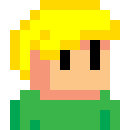
one such decision was the protagonist character design. "As lead graphic designer I created a number of character designs based on my initial
game concept featuring a humaniod as protagonist". team was interested in more obscure designs, eg: geometric robots that flung themselves around levels in the manner of a pinball machine.
I eventually saw the strength in this idea for the
number of gameplay elements it brought to the project, ie: the unique movement and manner of ricocheting
off surfaces".
PHYSICS ENGINE
the physics engine, making use of Box2D, was implemented early on by Tom which allowed us to see the concept in action and helped us to further visualise the possibilities of the game concept. it meant we could see early on what worked and what didn't and really helped the dynamic evolution of the game in the early stages.
RECURSIVE DESIGN ITERATIONS
there was a period of time when the game design choices appeared to be going through a number of recursive iterations, meaning decisions were made only to be revoked, and then made again. such was the inclusion of narrative as a key feature of the game. Tadgh wrote numerous story outlines that could be married to the game mechanic which in turn required alteration to the overall design. at one point we settled upon an open ended world with interconnected areas that would involve back tracking and multiple paths facilitated by the aquisition of various abilities. we eventually decided against such a design for a number of reasons: it increased the scope of the game requiring the creation of a large number of interesting environments that would avoid making back tracking stale. desigining areas with multiple paths through them would also dilute the game chalenges involved for each area would have to avoid being too difficult to navigate so as to avoid the player becoming frustrated. We identitifed the gameplay mechanic of focused point-to-point level navigation challenge as the most intriguing element that should be at the core of the game design and thus decided on more linear, stand-alone stages. in this way we can present a number of difficult frustrating challenges that add to the games enjoyment rather than detract.
GRAPHIC DESIGN
it was at this point we dropped all narrative elements from the game design in order to really focus on level design which would make the game the unique experience we were hoping to create. simultaneously, we decided upon a more minimalist graphic presentation. this arose from having spent so much time with Box2D's own primitive graphic engine and becoming more and more endeared towards it over the weeks. the graphic style we have is reminiscent of vector graphics used in the 1970s era arcade games and goes hand in hand with our more minimalist linear design approach. "Having moved focus away from drawing complex graphics I can now also contribute more time to level design which is an area I would much rather focus on".
POLARITY BECOMES BIPOLAR
at this time we learning of the existence of an earlier student game production titled POLARITY which had a number of similar elements which we planned to use. while we were all initally taken aback by the revelation it turned out to be more of a positive than a setback. "I took the core concept of platforming with repulsion and attraction mechanics and tried to marry it to other design concepts. Ideas like microbiology, or elemental particles like electrons and positrons which would give our game a different look and feel whilst keepingthe same mechanics. We decided to stay with the magnetism theme in the end though the process of trying to reimagine the game in a different way helped us to further solidify and focus on what makes our game design stand out.
Tuesday, May 25, 2010
Subscribe to:
Post Comments (Atom)

No comments:
Post a Comment